Total Sports Asia rationale Page 1

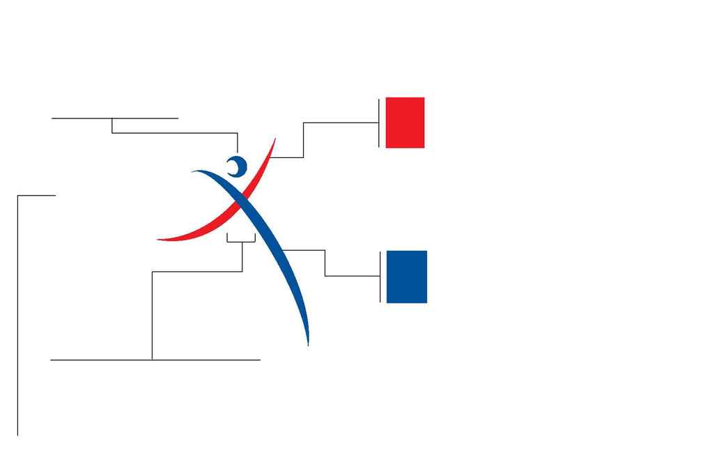
The logo seeks to permeate openness, objectivity and to promote the exchange of strategies, current learnings and hypothesis of the sports industry.
The rendition of the word "Ex" in exchange is a symbolic articulation of the human, will and spirit.
The crescent moon captures
the need for all of us to remain
open to new ideas and to
embrace the differences in
culture and needs in an open
manner.
The choice of the two lines surging upwards towards
a common shared vision promotes a knowledge-based
industry. Innovation, flexibility and responsiveness are
represented by the swoosh. The swoosh reflects
that we need to continuously look for new solutions
and creative ideas in its operations.
The fluidity and dynamism of the logo is balanced by the dignity and authority of the typeface, which reinforces the importance of building partnerships
through this exchange.
The color blue reflects the core of our
spirit. This continuous upward surge of
the blue lines reveals that we are
continually improving ourselves to
achieve success within the industry.
The color red radiates energy and confi-
dence, capturing the essence of a
progressive, talented knowledge-based
industry that is ready to meet global
challenges.
Sport
Change
